
Design 1 — Static and animated map showing current control in Russo-Ukrainian War
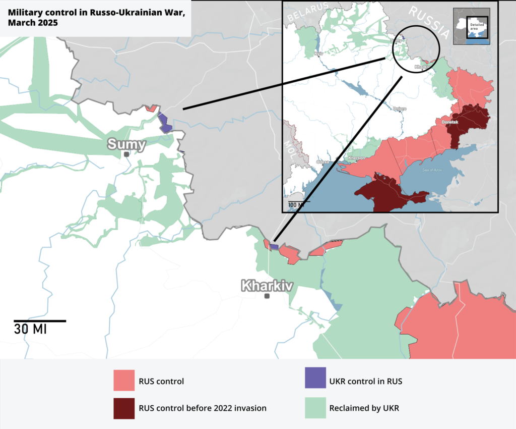
Sources: Data used from Liveuamap.com, cross-referenced with Deepstatemap.live and imported into MapCreator. Popup information sourced from General Staff of Armed Forces of Ukraine Telegram.
Process: Static map graphic created in MapCreator and compiled/edited in Adobe Illustrator. Map animation done in MapCreator.io, popups added in After Effects.
Time: Map created in about 75 minutes, animation in 90 minutes.
Design: After analyzing NYP’s mapwork, I noticed there were a lot of bold, warm tones and heavy contrasting red, black and white along with little icons for explosions and tactics. While NYP is known for their boldness, I chose to tone that back for the sake of clarity for the print version. With the animated map, I decided to show a brief day recap of notable moments, bringing in a little bit of those NYP icons/style while not taking away from the overall message of control in Ukraine.
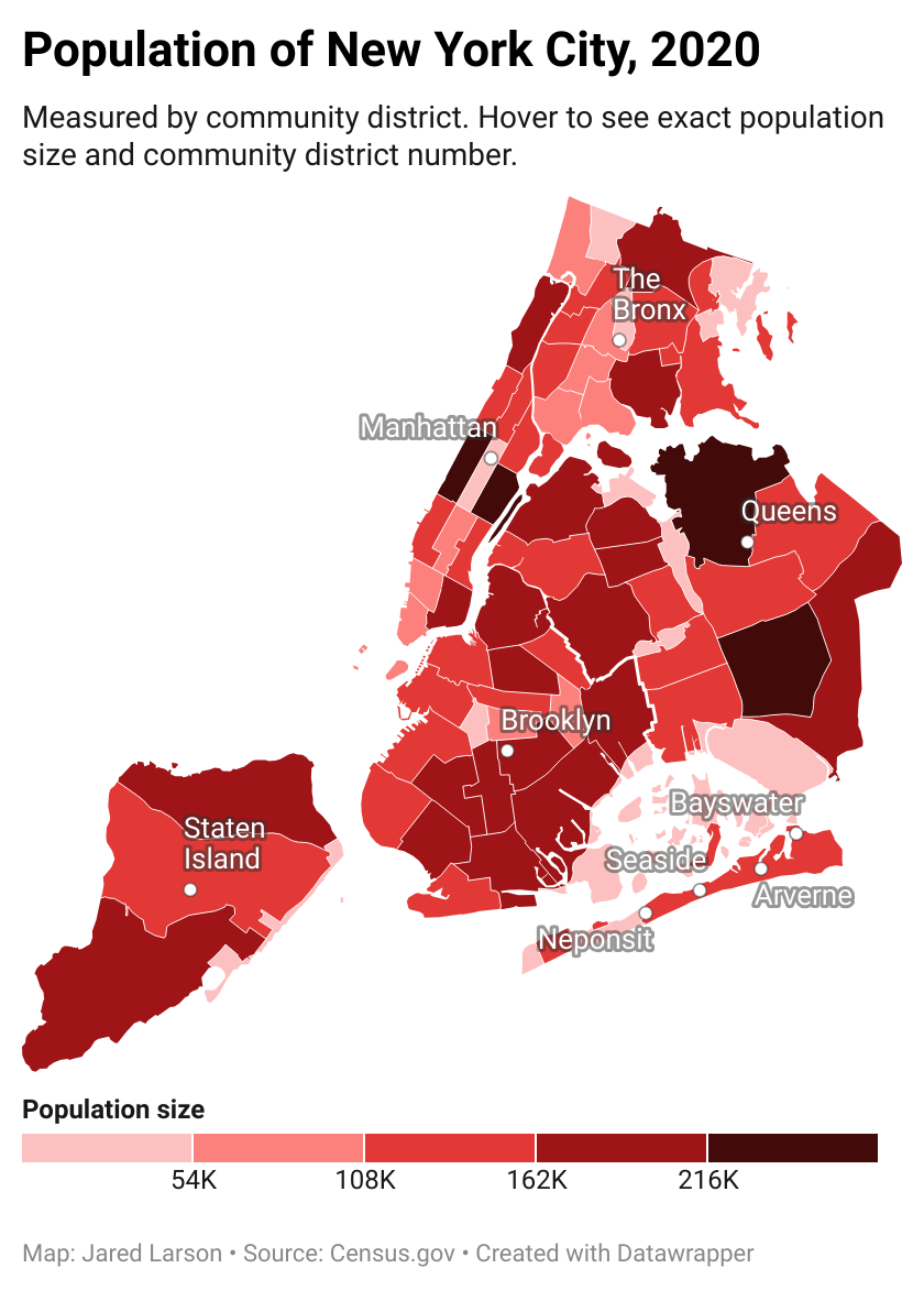
Design 2 — Interactive data visualizations of New York City’s population
Process: Downloaded most recent and complete data (<2020 exact, >2020 estimates/guesses). For data visualization #1, I cleaned up the CSV and imported it into Datawrapper, edited colors, added interactive features and text. My process was the same for the other three visualizations except that I used Flourish instead of Datawrapper.
Sources: Data used from Census.gov.
Time: It took about an hour to create all four maps.
Design: I focused on creating simple, clear and informative charts for both the web as quickly as possible. I chose bold, attention-grabbing colors that fit with the New York Post’s logo of red, black and white.
Idea for boosting interactivity and engagement for static posts
Sources: New York Post article + Instagram post
Process: Took branded elements and assets from post/article into Figma to create a carousel.
Time: Took about 45 minutes in design and prototyping of the Figma boards. Would be very short if just designing slides and posting on social.
Design: I noticed the Post uses a lot of static posts on Instagram. In my past work and from discussing with colleagues, carousels usually outperform static posts in engagement. So, I did a quick carousel design activity. Keeping with brand, I decided to omit the exact dish he ordered and kept the slides down to a minimum (pictures, context, quote and short link) to maximize interest. Organizations I have worked for have had branded short links to include in posts. Something to think about working with IT or site managers to create custom short links. In this case, I wrote a punny short link… another way NYP can explore their witty, punchy brand of humor.