In this video, I provide commentary on this page and my process in redesigning the Vanguard Robo-Advisor.
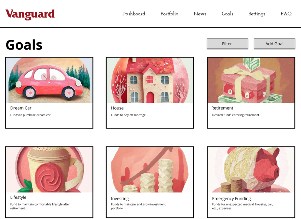
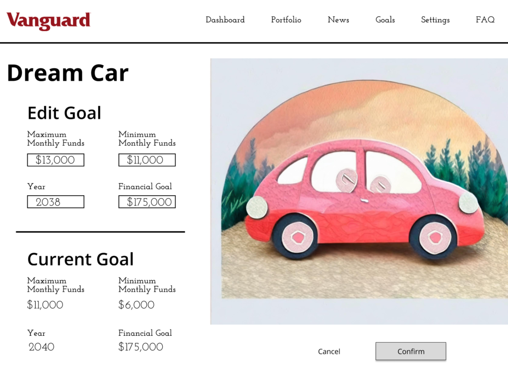
My goal in redesigning Vanguard’s Robo-Advisor dashboard is removing unnecessary clutter and giving users the most important information, clearly and instantaneously. My purpose in streamlining this dashboard and focusing more on financial transparency and explanation is to immediately rid users of any doubt in Vanguard’s product. As we found in listening session and usability tests, potential users care about transparency and security when it comes to the funds they are investing.
Usability Testing Highlights
5 out of 6 tested users felt Vanguard’s design was aesthetically pleasing.
5 out of 6 tested users felt Vanguard’s design was easy to navigate.
Of tested users with poor financial literacy, visuals were cited as helpful while text overload was confusing.
I feel like the information is broken up and not segmented well, it doesn’t feel like a cohesive page which made it difficult for me to understand.
20F
Catastrophic problem … understanding the Hurricane Chart
Audience Analysis
| Demographic | Description |
| Age | 25-40 |
| Income | Middle-class or higher. People with stable income seeking to grow their wealth |
| Education | Typically, a bachelor’s degree or higher |
| Occupation | Entry-level professional, student, recent graduate |
| Investment Goals | Save for major payments (i.e., cars, a home, etc.) and save for retirement |
| Financial Literacy | Limited |
| Values | Security, low to moderate risk investing |
Personas
Ima Imaginary works a stable 9-5 and eats three square meals a day. Breakfast is usually an efficient few eggs and bacon, & lunch a sandwich with chips packed the night before. Dinner is the only meal they don’t usually prepare for themself, usually relying on their significant other. Every once in a while, Ima goes out to eat, enjoying an opportunity to splurge, but only every so often. Ima’s significant other encourages them to eat out at luxury restaurants as a couple more often, but Ima believes that scarcity gives them something to look forward to.
Amelia Inheritor: Amelia is a recent graduate and pursued a degree in graphic design. She just started working full time as a freelance graphic designer and is seeking financial independence. Additionally, for graduation she recently inherited a large sum of money and is looking for investment options that boost long-term wealth accumulation in the future. She has limited knowledge of financial terms and jargon and has no experience in investing before but is curious about which options led to wealth accumulation with little effort due to the demands of her job. She spends money frequently for personal projects and likes to have little luxuries in her month-to-month routine. However, her main long-term financial goals are Maximizing returns on her inheritance and achieving financial independence as soon as possible.
Andy Anxiety — Andrew is a graduate student pursuing a mass communications master’s degree. Andrew keeps multiple jobs to keep a flow of income that supports his needs until graduation. He plans to work in city communications somewhere in California post-graduation. Andrew believes in working and investing for the betterment of community and larger society. Andrew rarely spends money on unnecessary items. While frugal and having a near zero tolerance for risk, Andrew prioritizes altruistic practices and reaching/keeping short term goals rather than long-term wealth accumulation.
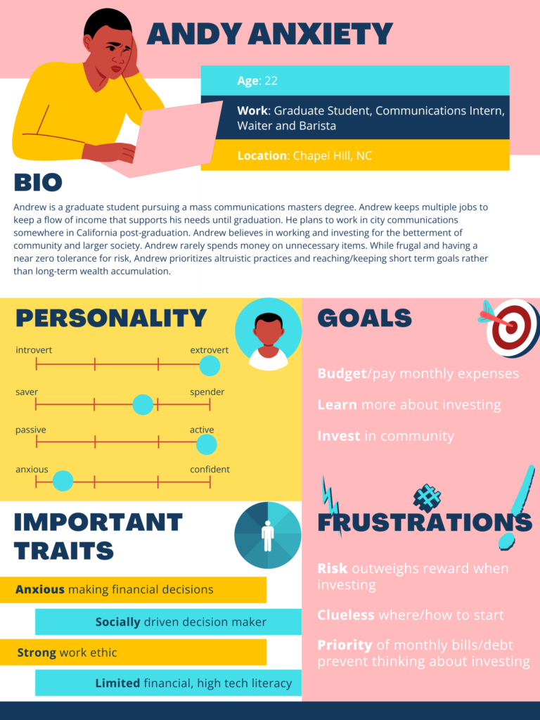
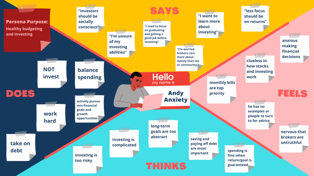
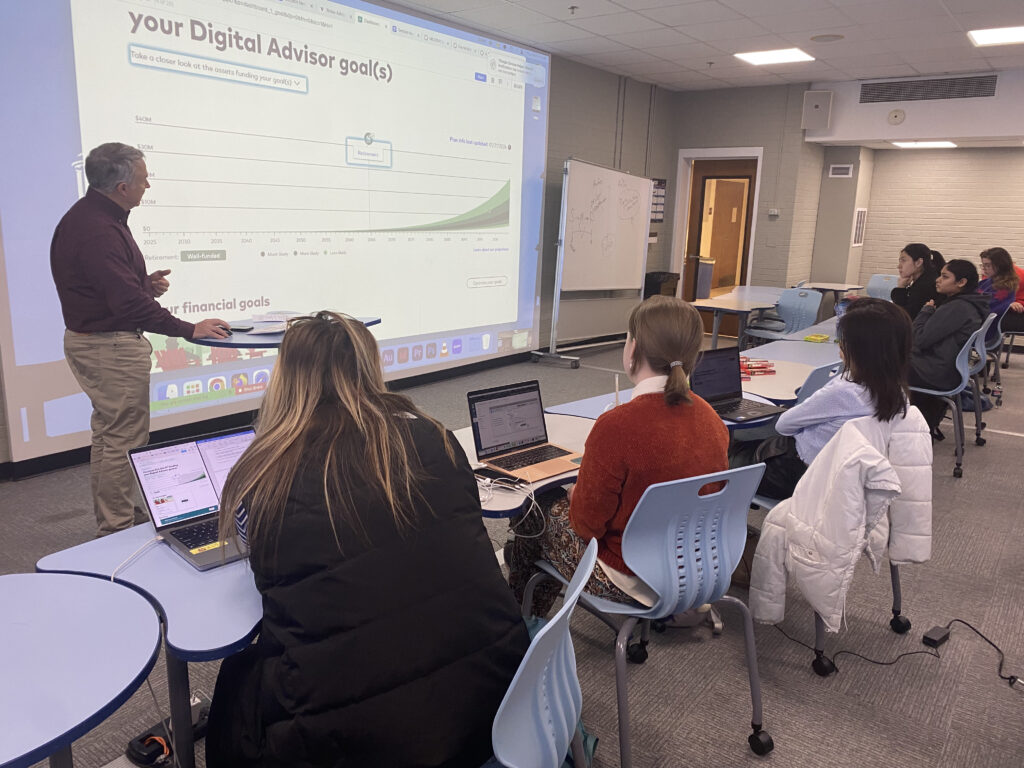
The listening session was key to how I approached my design and redefined how I thought about users. When first hearing about the financial advisor redesign, I thought it would be simple to narrow in on users’ values and goals. The listening session has shown me that the goals are not all about money, but other things like education, ethical investing, and clarity.
Card Sort
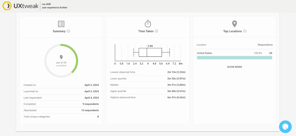
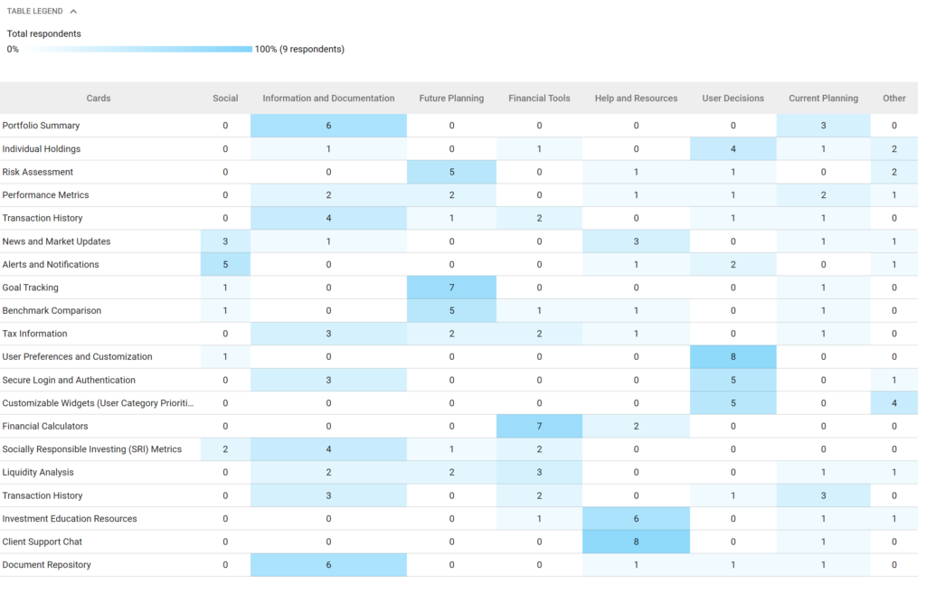
Given the feedback from our original usability testing and listening sessions, I was focused on creating a simple design with the least amount of financial jargon as possible. This card sort showed me how users are categorizing elements and terms. However, it taught me that complicated terms will turn users away.
https://app.uxtweak.com/cardsort/results/tRQAeUQaV3U4pt3Ljr28J/mNcX7Be6JvRqA7z2rv8yj
Flow Chart
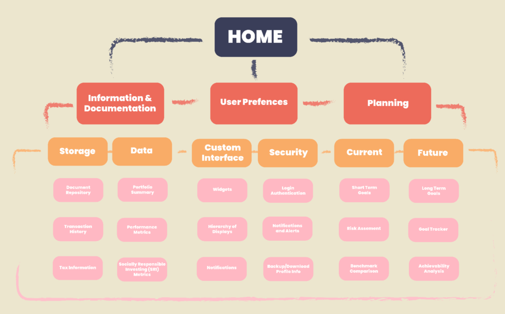
This is the original flow chart I created for how to navigate through the back pages of the site. In reality, I chose to focus more on the front pages of the dashboard to help fix the problem I deemed most critical.
User Flows


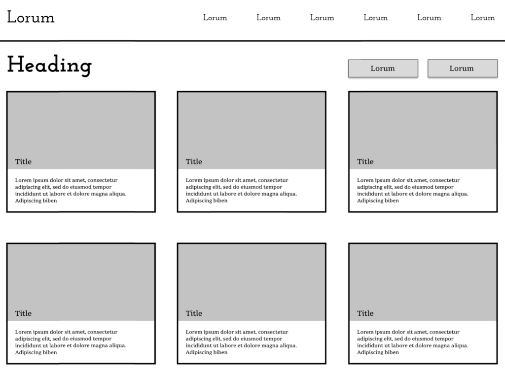
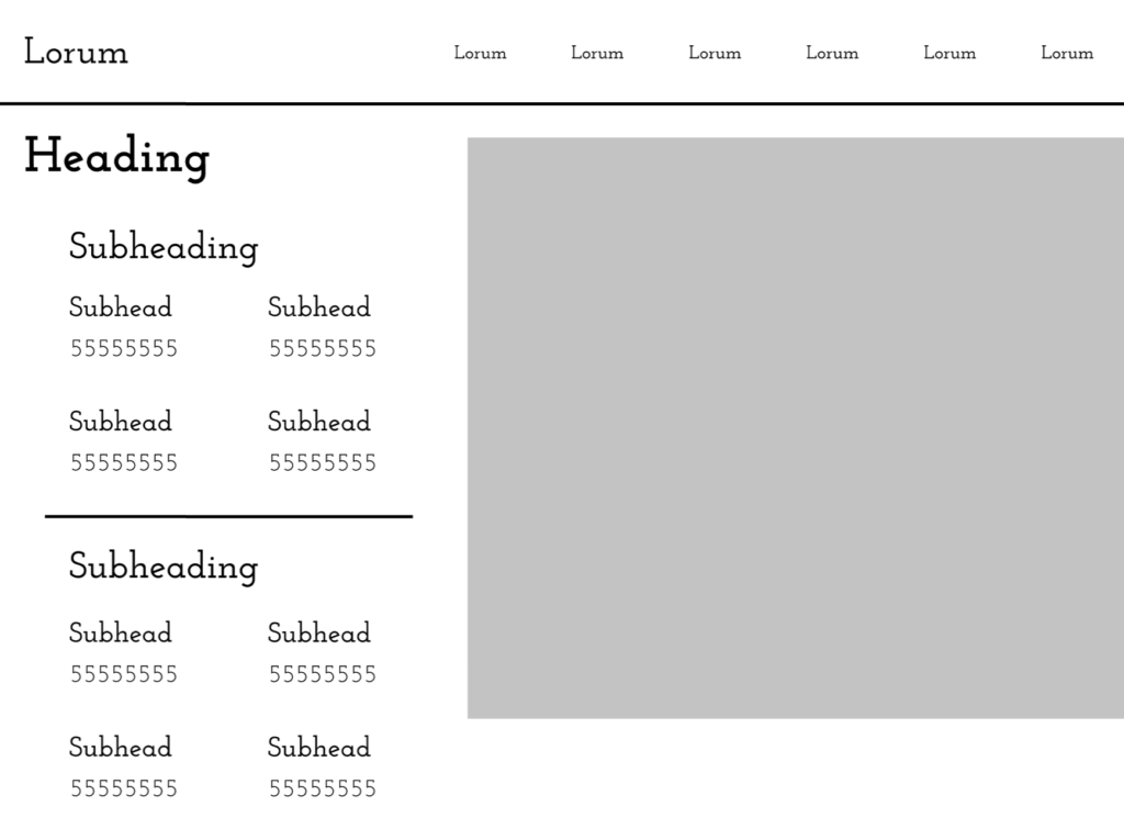
Wireframes
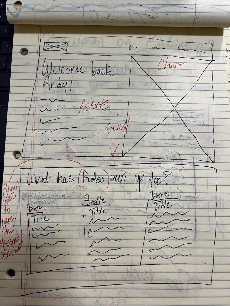
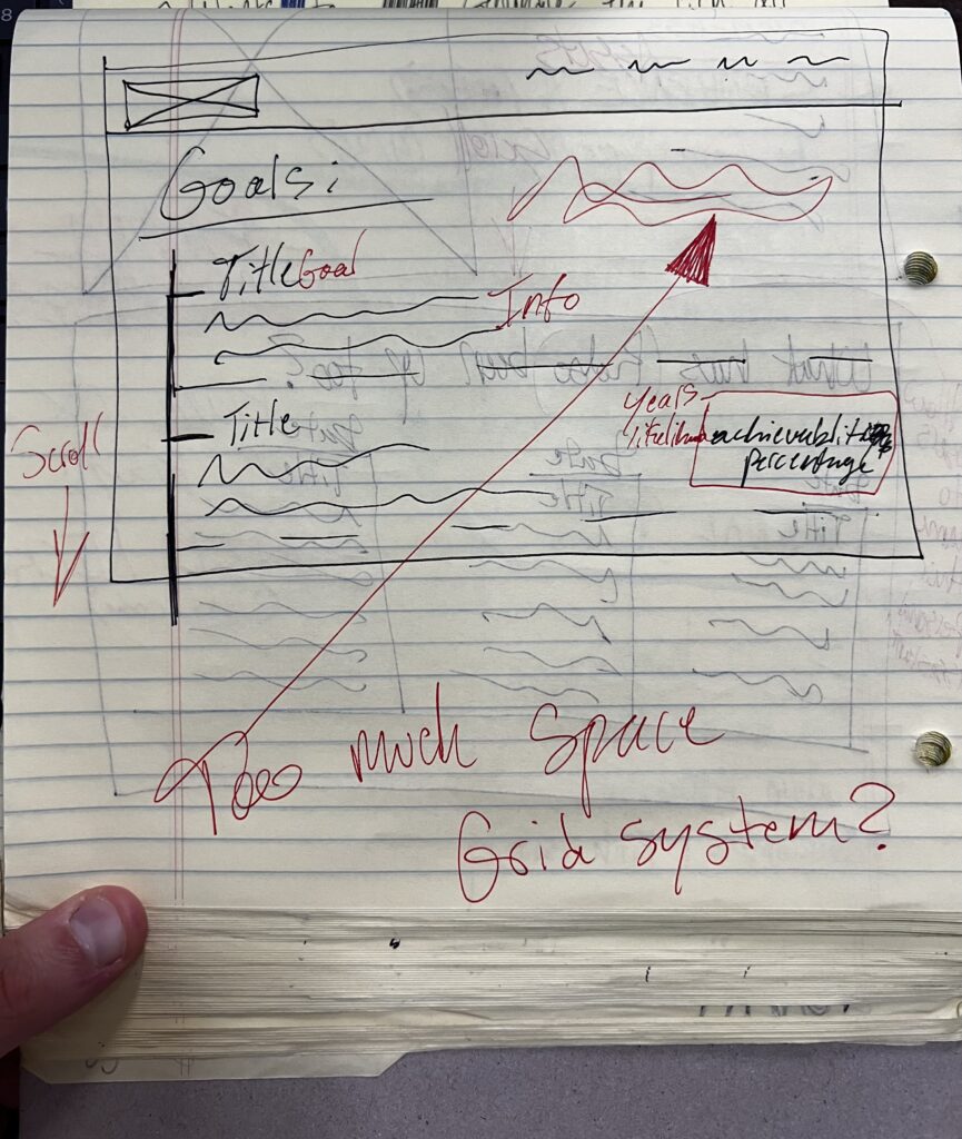
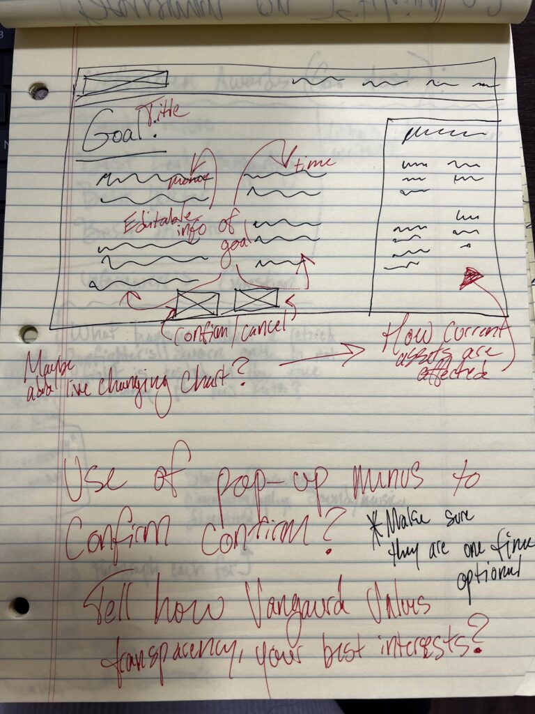
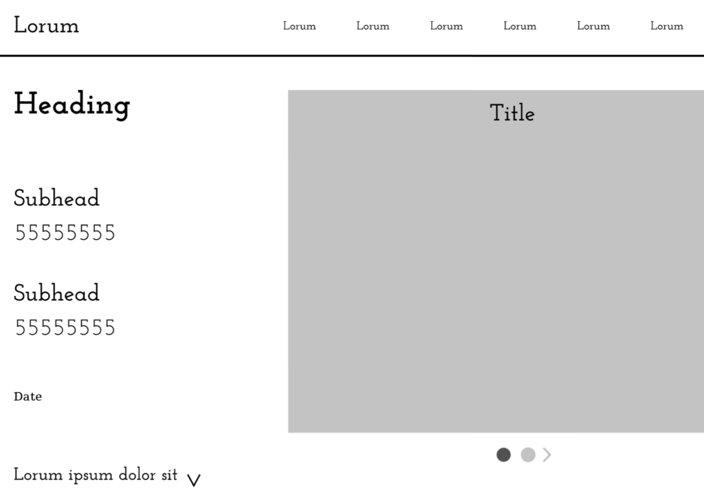
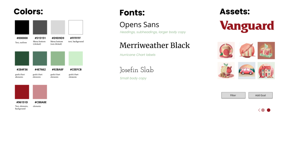
UI Kit
Hi-Fidelity Mockups
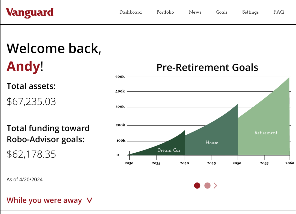
Prototype Figma: https://www.figma.com/file/QyyHNlvo8LjMWRCaM6449v/larson_hi-fidelity?type=design&node-id=0%3A1&mode=design&t=ERCgeaVzL6EdteHr-1
User Testing
User Testing Results: https://app.usertesting.com/workspaces/2434913/study/5127799/sessions?shared_via=link&share_id=rfOck1L9TH
The three user tests taught me that my design is simple and easy to follow as two out of three users completed both desired goals in under two minutes. The main thing I learned from these tests was that user expectation is critical to successful design. In the future, I will ask myself “What do people expect? What have they been trained to see here? What have they been trained to interact with and how?” more frequently.

